berniemakaveli: It looks like it's meant for an 8 year old....
jonAppleSeed: Looks like we've gone android :(
spokenblurb: Ooooooooooooo myyyyyyyyyyy goooooooodness I'm having a geek out attack it's soooooooooo dope
sirdir: I wish Forstall back, the new iOS is just plain ugly (like designed by a child on LSD) and buttons are no longer buttons... etc.
imaginex20:
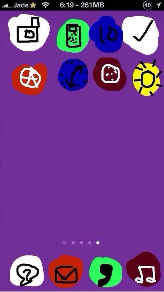
- I don't like the genie effect when you exit and app or enter a folder. It looks "low quality"
- Some icons look low-quality, kind of fuzzy.. I am not sure how to describe it, like seeing something not optimized for retina. e.g. the phone icon. Maybe I am just crazy.
- it's kind of laggy in some instances which is understandable as this is first public seed.
- In photo, when you zoom all the way out in the "photos" mode, everything looks overlapped and jammed together. Must be a UI bug of some sort. This is the same as Calendar event. Time stamps will overlap if current time is very close to the hourly time marker.
theelysium: My first look at the OS, disappointing.
The Flat look does it NO good. The icons look like cheap 60's renditions as if I hacked it and put on a bad theme.
The buttons and options to click on are not as clear as the previous design.
It's way too WinPhone and Android looking.
It is a bit laggy too. I'll have to wait and see if that clears up after it's done installing apps.
I am really not happy with it. I think Forstall (minus the leather and stupid felt) did a better job.
Basically the UI looks all thin and ran together, just like WinPhone. I wish Jobs was still here.:(
More...
The doc looks like an after thought. It was way nicer looking before.
I am confused here. As a designer you decide that you want the phone to look layered with depth and animated backgrounds. The icons & stuff move with your movements which gives it an almost 3D appearance. That's Great but, then they flatten the UI!??? It would look better with all the shinny icons and the elements of depth in the UI. It seems pointless to incorporate a visual element and at the same time take away the depth in the UI!
Ives "I have an Idea"
Tim "Yes?"
Ives "Lets incorporate a 3D feel and flatten it!"
Tim "Makes total sense! Lets do it!"
Consumers "WTF?"
评论中对新的设计几乎都是负面评价,Twitter 和 Facebook 上负面评价也占据 80% 以上。这种配色,不需要太专业的设计师背景,都会觉得不舒服。就像鉴别华强北的山寨机并不需要硬件工程师背景,就会觉得粗糙。
科技媒体的作者,碍于和 Apple 的关系,只好不提太多设计,只说 feature 的部分。
最终的销量会给 Jony Ive 一个耳光,就像 Windows 8 发布后做了这么多广告,依然不被接纳。
Ruby-China 的童鞋们,你们觉得设计得如何?
iOS 8 即将发布: